Styling a baby's room

No pregnancy news, friends! Today is all about decorating my nephew's nursery. When my sister & brother-in-law learned they were pregnant, they decided not to find out the sex of the baby. It's a challenge to style a baby's room without knowing whether it's for a boy or a girl, but I love it! A room doesn't have to be gendered for an adult – so why do we feel like it does for a baby or a kid? When you take "feminine" and "masculine" out of the equation you start thinking more about the feeling in the room and less about the wall color.

The mood board I pulled together is based around elements Candace had already decided on before having the baby... a blue rocker, a white crib, seafoam walls (Crystal Clear by Sherwin Williams). It was never intended to be a "boy's room" – it's just a coincidence that a little boy moved in. I'm convinced that if he were a she, "she" would still love it because of the feeling it evokes.

In my sister's words, she wanted this room to feel "a little bit cool, a little bit natural, and a little bit whimsical. Very happy, very playful, and not generic." Sounds great, eh? She got a good start without me – painting the walls and picking out furniture – but then a little baby arrived and distracted her with more important things...like kissing tiny toes and cuddling for hours on end. Y'know, the usual. Now she's starting to spend more time in the room & feels like the design has stalled out – something I can wholly relate to. Me being me, I pounced on the opportunity to become the favorite aunt lend my decorating advice.

Before I detail my master plan, let's see where the room stands right now. These are iPhone shots Candace sent me to jog my memory... long-distance decorating is not without its challenges:

baby-room-rocker.jpg
baby-room-1.jpg
baby-room-2.jpg

It's precious already, right? Candace has great taste, so my job is easy. Her main concerns that I need to address are that it feels too serious and that the blue chair sticks out too much. There's no denying that the accent wall and chair are the stars here. The challenge is getting them to gel with the rest of the room, but I've got some ideas for how we do just that.

1. Bridge the blues

Candace's fear of the blue chair not fitting in is valid – it's dark and everything else is light. They're both pretty, but they don't really relate to each other. Sure, they're both blue, but they're so far apart on the spectrum that they don't have all that much in common. We can bridge that gap by carrying the darker color over to the walls and by introducing a third (intermediary) blue. Here's an illustration of how this might play out on the wall: 

mur-triangle-wall-current.png
mur-triangle-wall-idea.png

Suddenly the chair feels intentional and at home. On the left, we've got 4 distinct colors: white, gold, seafoam and dark blue (actually called "ocean"!) Four is generally the max for a harmonious room, so it's counterintuitive to suggest adding yet another shade of blue. BUT in doing so (I hope) I've related the dark blue to the light blue so we can group them together in our minds as different shades of the same color. Yes? No? Maybe? Just go with it.

Then I suggest we take it a step further by bringing those darker blues into other elements around the room. And that brings me to suggestion numero dos...

2. Rug switcharoo

I love the current rug because it's really fun & bold & it echoes the triangles on the wall. However, I don't love how it competes with the wall for a starring role. We already determined the wall is the star, so the rug should be content as supporting actor. I'd swap it for something with a subtle pattern that ties in the darker blue from the chair. Here are a few that could work well:

These obviously aren't plain blue rugs. You could go that route, but these patterns work too because their scale is much smaller than the wall triangles. I personally love mixing patterns at every opportunity... I think it's a little more fun and exciting than committing to just one. Plus it's more of a challenge, so it looks cooler when you can pull it off :)

The second (more important) issue with the rug is that it's one size too small – this is a super common problem because big rugs = big $$ (usually). It's even harder to justify the expense of a big rug when you already have carpet. BUT, if you can swing the cost or find a good sale, I do think it's worth it. Rugs bring in color, texture and coziness that a typical carpet just doesn't have. Plus they make a room feel collected and layered. This current rug looks to be about 6' x 9', but the room, which is about 11.5' x 12.75', really calls for an 8' x 10'. 

2. Lighten up

Candace's house, like mine, has lots of boob lights hanging around. You know the ones... a ceiling flush mount that comes standard in lots of homes and just happens to look like a giant boob. While a nursery is probably the only place where such a light might be appropriate (boob jokes, anyone?), I'd swap it out for something a little more ...err... whimsical. Light fixtures can get 'spency in a hurry, but Ikea and Urban Outfitters have nice affordable options. This Maskros pendant from Ikea (left) is definitely playful... it throws fun patterns around the room. That could be fun for a nursery. The Boja basket (right) is another good Ikea option – this one brings in the natural element Candace wanted. Both of them have a nice texture and both offer a soft, diffused light. 

Maskros IKEA | Boja IKEA

Maskros IKEA | Boja IKEA

I'd also add lamps beside the rocker and the changing table for nighttime cozy vibes. Nothing kills the mood (or wakes up a sleeping baby) like flicking on the overhead light. Floor lamps are good for bringing in some vertical height, but in a carpeted kid's room I'd worry about it tipping over. Table lamps are a better option, but we don't have a lot of table real estate to work with. Instead, I'd hang a sconce or two. Here are some cute options that tie in the metallic triangles from the wall [confession: the middle light is not A) a wall lamp or B) gold, but it is C) a chime & light in one. And that's pretty cool):

3. Window treatments

Lights are great, but blackout curtains are the real saving grace in a nursery. I really like the ivory ones on the right from Urban Outfitters – the pompoms are playful without being busy, and the arrow curtain rod is cute too. The curtains on the left (from Anthropologie) are even more fun, but they're sheer... Womp womp. No matter though because we can always make our own by sewing some blue pompoms and tassels on regular blackout curtains. The window in the nursery butts up to the adjoining wall, so I'd stick to one wide side panel that ties to the right during awake time and covers the window during the sleepy time. 

4. Stylish storage

The only piece of furniture this room still needs is storage for books & toys. There are a few possible routes we could go: toy bins, wall shelves, or bookcases. Personally I prefer the latter two because they utilize vertical wall space. Right now, all the furniture is the same height, so the room's "skyline" is really flat. I'd like to add a tall bookshelf or a wall shelf hung high to break it up a bit. Let's call it encouragement for baby boy to start standing up :) The books & toys stored on them will almost certainly be colorful, so I'd stick to white shelves to keep it from looking busy. Here are a handful of options. (Sidenote: you can really see here how not white Ikea's white is with #2!)

5. Add the art

The triangle wall is already boosting our cool, artsy factor, but the other walls need some love too. Candace painted a cute chevron diptych that needs to be framed and hung, and a friend gave them a lovely hand-painted sign with baby boy's name on it. Other than that, I'm on the hunt for some prints that play nice with the color palette. One place I look for this kind of thing is Help Ink. It's a cool organization that features lots of different artists, and for every $5 you pay $1 goes to a good cause of your choosing. I first heard about them through Young House Love, and I like a lot of their smile-inducing posters and typography. Here are some that might work in this room:

Lastly, I want to bring in lighthearted, party vibes with garland and geometric paper hangings... I have a feeling one of these DIYs will come in handy!

That about wraps up my plans for now. You can see what else has caught my eye here on my nursery pinboard. I don't know about you, but I'm getting excited to see this room come together! I'll be sure to post pictures of the finished product before baby boy grows into a toddler ;)

Have you seen any nurseries lately that give you twinges of baby-mania? 

Effortless Wood & Leather Picture Frame

A super easy DIY picture frame made from suede cord and wood slats

Despite the laundry room's snazzy gallery wall, the powder room's funky wallpaper, and the living room's huge set of unstyled built-ins, I still feel like most of my walls are a desolate wasteland crying for help art. I guess that's as good a sign as any that I'm no minimalist.

There are a few reasons my walls are still bare – primarily a lack of art and a lack of frames. Go figure! Owning a house has suddenly made me very picky about what I put on the walls, and the filler from old apartments won't do anymore. I'm not trying to start a highbrow art gallery here, I just want a well-appointed collection of pieces that make me smile when I pass by. Is that so much to ask??!

As it turns out, it’s really hard to find good artwork that doesn’t cost gobs and gobs of money. Hence the filler and the empty walls. And more surprisingly, it's hard to find matted frames in stores that fit what I want to hang. Hence the lucrative industry devoted to custom framing. This is all to say that I've set off on an art-gathering, frame-making mission – and I'm starting simple with this majestic Rifle Paper Co. calendar cover and a (seriously) effortless frame. (Can we call it a frame? Cuz I am.) But before we get to that, I just gotta say I am in love with all things Rifle Paper Co. right now! The colors & illustrations are so charming and girly. "Girly" isn't my usual aesthetic & a calendar cover isn't my usual idea of "art," but I love this one & it makes me smile, so up on the wall it goes!

OK, back to the frame. This beaut is ridiculously easy – there are probably thousands of them hanging in ancient caves yet to be found by archaeologists. All you need is:

  • Something you want to frame – ideally on a thicker material (like cardstock or unstretched canvas)
  • 1/4" x 3/4" flat screen moulding – the length should be 4 times the width of your image + breathing room. For me, that was about 4 feet.
  • Suede cord – you can find this at any craft or jewelry store. I recommend flat cord rather than round because it's easier to tie. The length should be about 5 or 6 times the height of your image (better to err on the longer side). For me that was about 9 feet.
  • A saw – I used an $8 miter box saw from Home Depot. This thing is a life saver.
  • Wood stain – I used leftover deck stain in Cordovan Brown, but you can get tiny test pots of interior stain for $3 or $4
  • Paint/stain brush
  • Scotch tape
Step 1 is to measure the length of wood needed for tops and bottoms of this simple frame.

Step 1: Measure your first cut

I carefully tore this cover off my calendar and started by laying the wood across the top. I eyeballed the width, leaving about an inch of wood overhang on each side to give me space for my leather ties. I didn’t need that much space, but I like having the flexibility to swap in larger artwork down the line. If you prefer a more precise fit, a half inch would likely work.

I cut the wood for this simple frame using a miter box back saw set, found at Home Depot for $15

Step 2: Cut 4 wood slats

I used a miter box saw to make my cuts – to clarify, that's the yellow contraption with the slits in it & the back saw. We have 3 power saws in the house, but this school-bus-lookin'-get-up is ideal for accurately cutting trim & moulding. The bottom of the box has a lip that hugs the edge of the table, making it easy to keep it straight. Then you just slide in the wood, brace it against the side of the box and saw away. It takes a little more elbow grease than a power saw, but you reap what you sow. A precise, square edge! I used the wood from my first cut to measure three more – giving me 4 total.

I stained the wood using leftover Behr Deck Waterproofing Stain to get a rich brown color

Step 3: Stain the wood

This is totally optional, but I prefer a warm brown tone over the raw pine. I used leftover deck stain, which isn't ideal for this type of project because it's got a different consistency for weatherproofing. Ideally I would have had a small test pot of interior wood stain on hand, but  #rockwhatyagot! I laid my wood out on a paper grocery bag, brushed on the stain, let it sit for a few minutes, and then wiped it off with a paper towel. I did this a couple times, letting it dry for a few minutes in between coats, to layer on more color until I got the richness I wanted. I only stained the fronts & sides of the wood – not the back – and I let it dry overnight so as not to accidentally stain my picture.

Attach the wood to the picture with some scotch tape and leather cord

Step 4: Assemble the pieces

Once the wood dried, I laid a piece face down and lined the top of my picture to be just below the top edge of the wood and horizontally centered. Once it was positioned, I used a couple small pieces of scotch tape to keep it in place. This saved me the headache of having it shift around while attaching the other pieces. Then I lined up a second piece of wood on top to make a picture sandwich and broke out the suede cord to tie it all together.

I used suede cord to fasten the wood slats around my picture.

Starting on one side, I tightly wrapped the cord around both pieces of wood a couple times and made a knot. Then I gave the cord enough slack to hang from and knotted the other side the same way. I put my knots as close to the paper as I could to ensure a really tight grip on it. This sucker is locked doowwwwwwn. (Said like Will Smith in Hitch after he drank too much Benadryl)

My plan was to cut the cord after each knot, but plans are boring – I like to shake it up! While I was laying everything out I realized I liked the look of leather running down the sides to visually complete the “frame.” It makes it look more meaty & modern, less like an ancient scroll that may disintegrate at any moment.

I placed the bottom two pieces of wood just like I did with the top – taping the picture to the base and then lining up the front piece. I ran the cord down the length of the picture, wrapped it around the bottom pieces of wood a couple times and tied a knot. Then I ran the cord back up, wrapped it once again and tied another knot. I didn't do any fancy sort of knots – just whatever got the job done. Remember, effortless is the name of the game here. The only tricky bit in this entire project was making sure these side cords weren’t tied too short (making the paper billow) or too long (lookin' like a dangled mess). I found the easiest way to test the length was to gently pull the top and bottom pieces of wood in opposite directions, fully extending the picture. *clears throat* I mean, I ran it through my gravity simulator and computed the results to 1/1000000000th of a micron thus fully accounting for the Earth's rotational effects on the last Monday of the 11th month of 2014 and the fibers and #science.... right. So we're clear now... moving on!

A close up of how I knotted the suede leather cord

My suede cord came in 2-yard increments, which was enough to tie the tops and one side. I started with a fresh piece of rope for the other side, knotting it at the top, repeating the process of running it down the side, tying it at the bottom, and running it back up. Above is a close up of the knot on that second side. Super precise, right? And ba-da-bing-ba-da-boom! Finito!

An effortless suede & wood frame DIY

I love when things that look effortless actually are effortless. Unlike my messy-but-not-too-messy "bedhead" today. I did this entire project one night after work (+ some drying time for the stain), and now my "items to hang" pile is one piece shorter. Phew!

What's your process like for hanging things on the wall? Do you just put up whatever you have on hand or meticulously collect and plan every last nail? Would a calendar cover make the cut in your house? That last question is a trap... ;) 

Trying Not to Ruin the Wallpaper

It's done! It's done! The powder room is done!

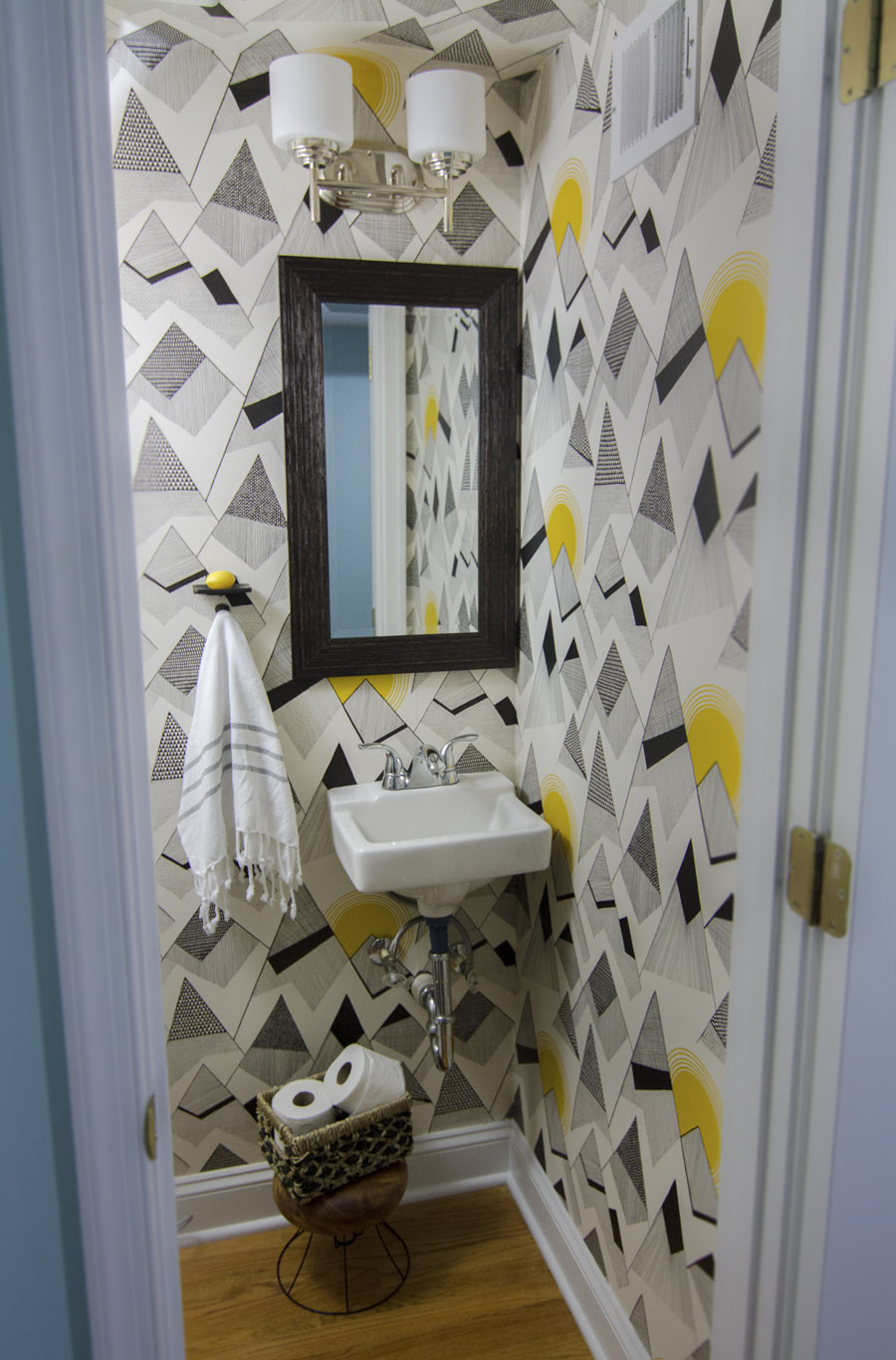
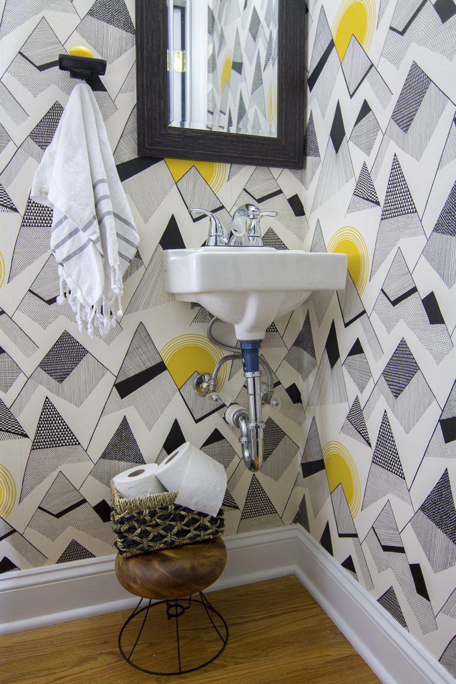
Wallpaper is "Mountains" by Miss Print courtesy of Wallpaper Direct, soap dish & hook are from Signature Hardware, and mirror is from Homegoods

If you’re confused because you saw me finish the wallpaper 4 months ago, then that makes two of us. What feels like an eternity in blogging years was double that IRL (that's 8 months, in case it's too early to be doing math where you are). And yet the powder room was still not finished! What was the hold-up, you ask?? 

Gardenia soap dish form Signature Hardware & "Mountains" by Miss Pixie wallpaper

A spot for the soap & hand towel. A small thing, I know – & yet so important. I should probably be embarrassed, but I’m too busy being relieved. It was like running the race of my life and then crawling the last 20 meters in Crane Pose. Anti-climactic much?

I've never given much thought to the soap & hand towel sitch in other bathrooms. The soap goes on the counter, the towel goes on the towel bar. #NoBrainer And yet suddenly it wasn't so obvious once I found myself with a doll-sized bathroom, a doll-sized sink and wallpaper that I'm terrified of putting holes in. What I really wanted was this mirror from Anthropologie (or this one!) with an attached shelf for soap because that would be a 2 birds 1 stone scenario – but I couldn't bring myself to spend $300 on a mirror for the powder room. Maybe someday...

I was driving myself crazy looking at affordable options & liking none of them when I stumbled upon these little cuties on Signature Hardware’s website. They were simpler and more rustic than anything I'd considered before, but I think that’s what I liked most about them. The wallpaper is the true star here, and these guys are perfectly happy to be out of the limelight and revel in their understated charm.

      Gardenia Soap Dish

      Gardenia Soap Dish

 Solid brass hook with porcelain knob

 Solid brass hook with porcelain knob

I was gonna have to suck it up and put some holes in the wall. Four to be exact – enough to nearly give me a heart attack! So I did what any normal person does when they think they're having a heart attack – I consulted the all-knowing interwebs. Obviously. Experts seem to agree on this method for protecting the sanctity of your wallpaper: cut an upside down V in the wallpaper, peel it down and put your nail hole directly in the drywall. Then, when you decide to move whatever was hung there, you should be able to paste the paper flap back where it was for a seamless repair. It sounds pretty clever – but I'm hoping I never have to find out if it actually works. I just went with it, and so far so cute.


Signature Hardware's Gardenia soap dish & solid metal hook in oil-rubbed bronze

All the success stories I’ve read to date talk about using this trick for itty bitty nail holes. I, on the other hand, needed some big honkin’ craters for drywall anchors and screws. That complicates matters because any repairs would require me to remove the anchors, spackle the gaping hole where my heart used to be and sand it down to be level with the drywall I can no longer see – all without messing up the wallpaper. Should be fun! This is either a really dumb idea, or it’s a perfect example of "scaling up." Don't worry, guys. I have some spare paper lying around if things go totally bananas.

If you have wallpaper and feel like taking a leap of faith with me, here’s how I hung these fixtures:

1. I started by choosing a position on the wall. This gets its own step because what's usually a simple task feels like a high-stakes gamble when wallpaper is involved. I wanted the soap & towel to be convenient to reach when standing at the sink so guests don't have to bend down, reach up, or smush their arms like a T-Rex to dry their hands. I also wanted them to sit at a point in the pattern that would help me camouflage future hypothetical repairs.

Powder room complete with Signature Hardware soap dish & towel hook as well as Miss Pixie's Mountains wallpaper

2. Next, I leveled the hanging plate and just barely marked my holes with pencil. When I say "just barely," I mean my mark could have been confused for a microscopic dust particle. It’s a miracle I could see it at all.

Use a level to mark the position for a soap dish

3. Then I held my drywall anchors up to the wall & centered it on the microscopic-dust-flake-of-a-mark to determine how big of an upside-down V I needed to cut. The answer, to my dismay, was “Really big.” : [

I held the drywall anchor up to the wall to mark the size of the cut in the wallpaper

4. Then for the “Here goes nothing” moment — I used an Exacto knife to cut the upside-down V big enough to comfortably surround the drywall anchor on all sides....... What's done is done.

5. Gently, carefully, nervously I peeled the wallpaper back from the wall and bent it down. My two cut-outs looked like evil Jack-o’-lantern eyes saying, “What have you done?!”

I peeled back the wallpaper to make room for my drywall anchors

6. Then it was time to bring out the big guns, and by guns I mean drill. I drilled 1/4” holes on my original marks and then screwed in the cool drywall anchors that came with my soap dish. Those eyes just got a little creepier...

Drywall anchors in

7. From there it was a matter of attaching & adjusting the hanging plate so it was level. I screwed it in most of the way, checked the level and then tightened it down. The actual soap dish hooked onto the plate with a little screw. 

I used my drill to drive screws into the anchors

It was essentially the same dealio for the towel hook, but with smaller holes and cutouts. Thank god. So there you have it. This room is fully functioning now! And my little Low-Cost-And-Found stool that I made from a lampshade is doing a fine job holding that extra toilet paper!

The powder room is finally finished after adding Signature Hardware fixtures for hand soap & towel.

This entire powder room makeover cost me less than $150, and the results are not too shabby if I do say so myself! It wins the honor of being the first "finished" room in the house. Also the smallest. ; ] Huge thanks once again to Dana Miller of HouseTweaking & Wallpaper Direct for gifting me this awesome wallpaper. The pattern is "Mountains" by Miss Print.