Tackling a New Space: Nick's House

masculine-living-room-1.jpg

More lighting | Window Treatments | Coffee Table | Bigger Rug | Media Stand | Accent Chair | Fun pillows | Credenza – IKEA BESTA, I think | Party Seating

You know the folks you see on HouseHunters who insist they need a huge open space to entertain all their many friends? And you (the person binging on HouseHunters and oreos alone on the couch) can’t help but think, Who ARE these people with so many “friends” and so many “parties” to attend? If I didn’t know better, I’d think they were making it all up to look cool on national television. But I do know better, because I know Nick. He’s our friend who enlisted me to decorate his place in DC, and I’m convinced he has a close personal friend in the city for every single person I interact with in a three-month period, including cashiers, bus drivers and security guards. He’s just a magnetic, likable, interesting guy. He throws dinner parties and happy hours like nobody’s business, but his place really hasn't been living up to his standards as the ultimate entertaining space. To be frank, he was starting to get a little self-conscious about being a real-life adult who invited other real-life adults to come over for dinner at his bachelor pad that looked fresh out of college. He’s at the point in life where he wants his home to feel grown-up and settled, and he really wants it to serve as a welcoming and comfortable space for entertaining. 

Nick's living room before

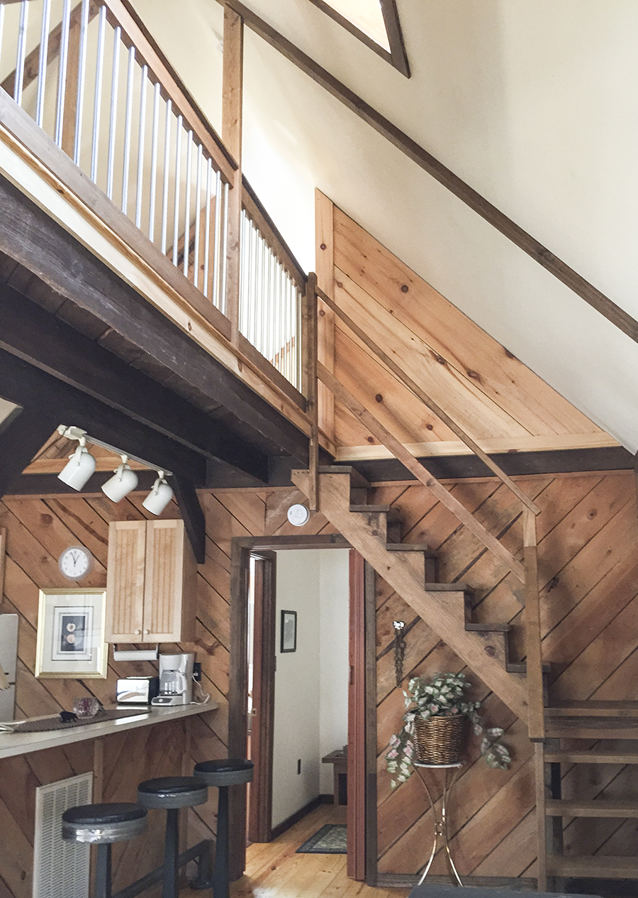
Nick's place is d-rippppping in potential, so when he asked for my help I couldn’t say yes fast enough. It’s HUGE by city standards, with an open floor plan, gobs (I mean GOBS) of natural light, and a landlord who is game to make some improvements. That’s right – landlord, we’ll call him LL for short. This is a rental, which means the sky is not the limit, but I’m excited to see (and show) what’s possible without going overboard. The LL has agreed to replace the shabby broken window blinds with some roman shades I picked out, paint the (water-damaged) walls a color he agrees to, and even make some big (low-cost) improvements in the kitchen (hint: the top cabinets are falling off the walls). I’m not sure how Nick got him to agree to all that – he should probably get a diplomatic medal of honor. My guess is it has something to do with him being a dream tenant for the last 5 years and his not planning on leaving anytime soon.

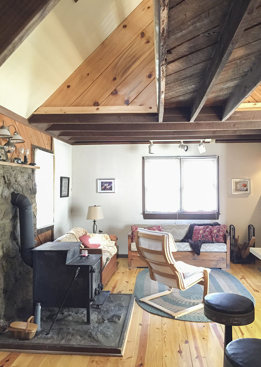
That said, most of Nick’s own money in the space should go toward things he can take with him. He has most of the big pieces already – a versatile sofa he purchased last year, an extendable dining table, a credenza, and a TV. Everything else is fair game.

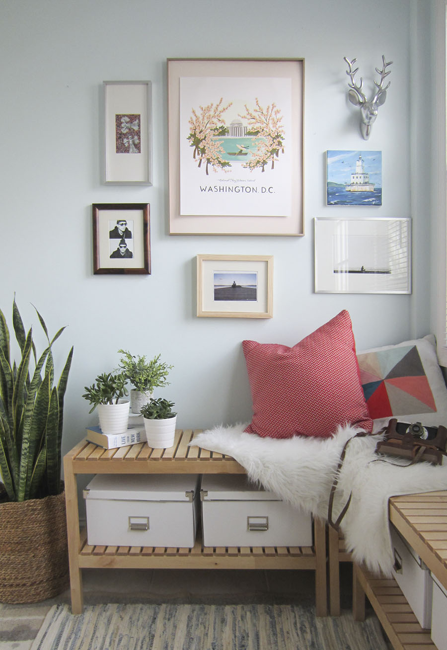
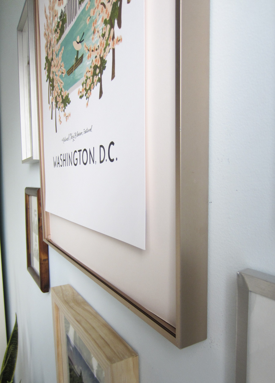
The first thing on the chopping block is the rug. The current 4 x 6 shag was a quick buy on Amazon, and it’s about a third of the size this room needs. We’re upgrading to a 9 x 12, which is big enough for each end of the sectional to get a leg on. I considered going even bigger than that, but there's a small step up from the living to dining room that cuts the floor space at an angle. A 9 x 12 would usually cost an arm, a leg and a firstborn, but RugsUSA is almost always running a 75% off deal that makes it way more reasonable. Since we’re going safe on the wall color (remember LL is making the final call), and given that the sofa is a huge swath of gray, I picked out this blue-and-white moroccan shag to bring in some color and personality. I’ll carry the blues around the room with pillows, vases and artwork, and inject some organic energy into the space with house plants. 

Nick's living room before

Second order of bidness: seating. Nick needs the kind that’s always available (like a cute, new accent chair), as well as the kind that can be stashed out of the way during business hours. I’m a fan of the Oswald tufted slipper chair from West Elm – it’s low-profile, reasonably comfortable and the frame gives it just a little touch of quirk. For stashable seating, I opted for the Terje folding chairs from Ikea – they’re affordable, easy to find if we need more, and they’re wooden. They feel sturdier than plastic folding chairs and classier than your basic metal option, plus they’re more comfortable than a backless stool. (You know you’re a grown-up when back support factors into your design) The Terje’s back has a convenient hole for hanging, so rather than take up precious closet space, we’re gonna keep them on the inset wall by the juliet balcony – out of the way but within arm’s reach. Here's a 3D rendering I built of the space so you can see what I'm talking about: 

Rendering of Nick's place

Rendering of Nick's place

The new coffee table will follow the same ethos – there when you need it, gone when you don’t. Nick loves having the ottoman in front of the couch for vegging out – because who wouldn't? –but he could really use more surfaces for guests to set down drinks and plates when he’s puttin' on the ritz. In addition to some side tables and trays, I think he could benefit from a fold-away coffee table like the one I have, where the top lifts off and the legs fold together so you can stash it when you need the floor. Then when you need a coffee table you just holler, "Annie, get the legs!" and BAM. Coffee table at your service. 

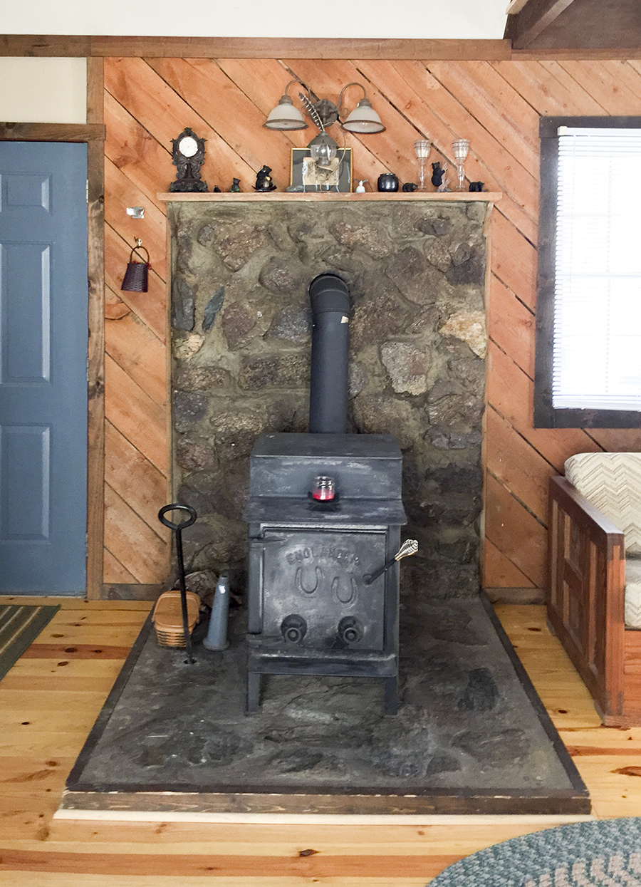
Perhaps most important for a good party (or life) is lighting! This apartment has more windows than I thought possible on a row house. It’s amazing during the day – the light streams in from all directions – but it’s seriously lacking at night. No dinner party (or room, for that matter) should be without mood lighting, y’all! Nick has a couple lamps but they're the kind that feel like they might collapse at any moment. So we’re bringing in some funky plug-in sconces, table lamps, and a big pendant over the dining table to get the party started. 

Nick's dining room before

Speaking of the dining table – it’s usually used as a desk like you see up there, and then Nick moves the computer when he's having people over. I want to change that. The thing is, this table is basically the first thing you see when you come up the stairs from the front door, and I can’t help but think it must be a wee-bit demoralizing to finish working a 12-hour day, climb 40 stairs up to your apartment and then immediately be greeted by more work you could be doing. No thanks! Instead, I want the table to be a nice focal point that says, “Hooray! You made it! You’re home! Dinner is on its way! Make yourself comfortable!” Y’know? So I’m banishing the iMac from the table and creating an office nook where the Billy bookcase is now.

Nick's living room before

The desk isn't on the mood board, but I'm looking at this one from CB2 or perhaps blinging out a modular closet like Dabito did here.  I want something wall-mounted to optimize the space and with shelves overhead so we don't lose the storage. What doesn't fit on the new shelves will go inside the existing credenza, which we're relocating to live by the balcony (see below).

Rendering of Nick's place

Rendering of Nick's place

Currently it's hiding between the back of the sofa and the table and it's taking up space where we could be seating people around the table. The sofa looks super low-profile in the photo below, but that's actually where the step is that I mentioned earlier. The floor of the dining space is a few inches higher and we don't want anyone falling off the ledge when they go to stand up from the table, alas, the credenza must move. It will have a much happier life by the balcony where he'll serve as the drink station and be the most popular guy at the party. 

Nick's living room before

The last big item I want to replace is the TV stand. It’s tough to make a TV look nice, but a sharper, brighter media stand with some closed storage would certainly help. The current stand is the same color and width as the TV, making it an even bigger eyesore. I want to get a stand like the Stockholm from Ikea, which would fill out that space better while still being low-profile and visually light. In case you’re wondering how practical it is to put your cable box behind a door, allow me to introduce you to the narrow band antenna. You can hide your cable box and eat it too! Uhhhh… I mean you don’t have to be able to point the remote or even see the cable box to be able to control it with an antenna like this. Forget Ryan Gosling, THIS is God’s gift to women. ;)

Nick's living room before

Blasphemy aside, I'm VERY excited to see this living/dining situation come together. It's been really refreshing to work on someone else's house and get out of my own head about my house. In addition to the living room, I'm also working on the kitchen and if all goes well with those we may tackle the bedroom too. I’ve spent enough time blabbering already, so I’ll save the kitchen for a different post.

What have you guys been up to? Any updates that made all the difference in your rental?

7 Tips for Small-Space Living

7 tips for small-space living via Little House Big City

2015 has been off to a bumpy start – with a torn ACL/meniscus (Eli’s) and an ugly stomach virus (mine), we haven’t exactly been in the best shape. Maybe you guessed as much from my absence here, BUT there have been some really awesome things in between those sucky bookends that you can look forward to seeing on the blog in the coming weeks. We installed under cabinet lighting and a tiled backsplash in the kitchen, found the perfect Italian leather sectional for less than our grocery bill, started redecorating our friend’s apartment, and took a quick trip to NC to visit my family (not blog-related but 100% necessary and wonderful). And this past weekend we headed out to a tiny cabin in the mountains to escape the city and hit “refresh” on 2015. (Please pardon the poor photo quality – I forgot to bring a camera so these are iPhone pics!)

Unsurprisingly, I was most excited and inspired by the cabin itself. I mean, it certainly isn't in the running for any decorating contests, but I loved its utilitarian charm, its spacious itty-bittyness. If you don’t know this about me already, I’m a very big fan of the tiny house movement, and I dream of building my own little house from the ground up someday. The idea of designing a home that has everything you need for daily life neatly packed into the smallest space possible is like a giant puzzle, and the cleverness involved is by far my favorite aspect. Wait, did I say "by far?" Maybe not...living without a mortgage is high up there, too. That idea alone makes my mouth water and my mind wander off on exotic vacations. And then there's the nostalgia of it all...it's romantic in a “back to basics,” foraging for berries and harvesting the carrots and bib lettuce for my salad kind of way.

As far as micro-dwellings go, this place was big for 2 people – it would be “tiny” for a family of 4 – but it got my wheels turnin’ and ideas whirlin’ just the same. Here are the 7 things I noticed that could really make or break our mini-living dreams:

7 tips for small-space living via Little House Big City

1. Tall ceilings can make any room feel spacious.

It can be tempting to pack in more floor space by adding levels when you're working within a small footprint, but sometimes you get more from having less. (Man, that’s deep) Our cabin might have felt claustrophobic if not for the vaulted ceilings. Add lots of natural light plus an open floor plan, and it’s positively airy. 

7 tips for small-space living via Little House Big City

2. With great airiness, comes great noise... and a greater need for noise control.

I think noise would honestly be the biggest challenge to raising kids (or living with anyone, really) in a tiny house. On Saturday, Eli got up before me and I heard every tip toe and opening door. Luckily I was a trooper and still managed to sneak in some extra weekend Zzzs, but I could see that being a problem with a baby and light sleepers. Soft-close doors, drawers, and well-greased hinges are necessities rather than “nice-to-haves.” A sound-absorbing floor is another must. Carpet reigns supreme in that department, but I’d still prefer hardwoods with a sound-proofing subfloor, cushy area rugs, and a strict no-shoes policy to stifle the blows. You'd want to also plan for thick, insulated walls, solid doors, and soft decorative accents (think pillows, couch, curtains) to really ensure the whole family is sleeping pretty.

7 tips for small-space living via Little House Big City

3. Stick to a consistent, neutral color palette

This coming from someone who loves color. In an itty bitty home, it's best to cut down on visual clutter by keeping the walls and furniture neutral. Doing so allows them to fade into the background and creates a calming vibe where your eye can just lackadaisically flow around the room without bumping into things.

7 tips for small-space living via Little House Big City

4. Speaking of bumping into things…lose the stuff

When you're living small, variety is the spice of a chaos. Taking it back to basics is key to avoid feeling like you live in a closet. I’d likely have to shrink my wardrobe by 98%, nix the kitchenwares we only occasionally use, and digitize files ’n such. But that’s not such a bad thing, is it? I think it's doable – even freeing to have fewer things to store.

7 tips for small-space living via Little House Big City

5. Tidying up is more important but easier, too.

A cup here, some shoes there, a cabinet ajar, and suddenly your small home feels like a big wreck. (Another reason to question how parents do it) Growing up, my family called me the Quicker Picker Upper because the moment they turned their backs I’d have put away whatever they just set down. I guess I let myself go in my old age, cuz even I found it challenging to keep up with our “messes” this weekend. Then again, with fewer things to put away and a smaller floor to mop, I’m sure it wouldn't take long for it to become a reflex again.

7 tips for small-space living via Little House Big City

6. Use subtle design details and display the things you love most

Big or small, your house should feel like home. And no better way to do that than hanging art you adore and introducing considered details. My favorite in the cabin was the use of diagonal boards on the walls. They added texture and warmth without calling too much attention to themselves. 

7 tips for small-space living via Little House Big City

7. Embrace the outdoors

The tiny houses I fall in love with (like this one) always seem to be on a clearing in a majestic forest with a pristine pool, or overlooking the ocean and white sand beaches. If we do build a little house for ourselves, it's gotta be in a place like that...with a view, a hammock, and lots to do outside. I'd want the living area in my hypothetical home to open up completely to the lawn, with an area for eating, gardening, roasting marshmallows, sunbathing ...and while we're dreaming, how about a pool and an outdoor shower, too? Can you tell how ready I am for summer? 

And there you have it... my 7 tips for living comfortably in a tiny home. What do you guys think – did I forget anything? Anyone else jonesing to build a micro-dwelling? 

How to Float Mount Pictures in a Frame

How to float mount pictures in a frame, via Little House Big City

If you asked me what’s the 1 thing I’m most embarrassed about when guests come over, I’d say it's a tie between my junk-filled guest room and the number of naked walls begging for some personality. I mentioned back in October that I’m being incredibly picky about what I put on my walls now that I own a house. In previous apartments, whatever I could find for less than $30 at Homegoods would do, whereas now I want pieces that are more meaningful to me.

Last christmas my little sister gave me this print from Rifle Paper Co. that I adore because it reminds me of my favorite time of year in the city AND because I continue to nurse a sick obsession with all things RPC. It only took me two months to get this print up on the wall, which has gotta be a new record. 

How to float mount pictures in a frame, via Little House Big City

Matting and framing can be an intimidating and expensive process – as in I almost spent $100 to get a pale pink mat cut for my 16 x 20 image. Thxbutnothx. Then I got wise and did it myself for 10 bucks (thank you, self, for giving me such a good deal). I decided to float my print instead of going with a traditional mat because it feels fresh and unexpected, plus it's a heck of a lot easier to do in my very humble opinion. A float mount is when the image looks like it's hovering on top of your mat rather than peaking through a window. It's ideal when your artwork goes to the edge of the paper or when you've got a nice textured edge. My print fit neither of those scenarios, but I do what I want! We'll all float on alright, Already... 

Supplies:

Step 1: Cut the mat board to the size of the frame

How to float mount pictures in a frame, via Little House Big City

Making sure I was working on a totally clean surface, I laid the mat board face down and marked my cuts using the back of my frame. Then I held my straightedge firmly on the line and followed it with a box-cutter. Mat board is surprisingly sturdy and it took me a couple attempts to figure out that I really needed a brand new blade, and I needed to press down pretty hard. It's also a good idea to have something tough underneath to protect your table... (whoops)

Step 2: Mark where you want the picture to go

How to float mount pictures in a frame, via Little House Big City

I centered my picture on the mat board (still face down), eyeballing the position, then checking with a measuring tape before tracing the top corners.

Step 3: Cut a slit a little narrower than the picture

How to float mount pictures in a frame, via Little House Big City

Once I knew where the top of my picture would be, I cut a slit about an inch lower than that and about two inches narrower than the width (an inch from either side)...that way the cut will be totally hidden once the picture is in place. 

Step 4: Apply hinging tape to the back of the picture

How to float mount pictures in a frame, via Little House Big City

How many types of tape does one world need?! Gummed hinging tape! Never thought I'd buy something so specific, but this stuff is used to preserve the sanctity of all that is holy in your artwork/photo/certificate/whatever. It's actually very nice because it holds well but can easily be removed later. The specific variety I used is great for heavier weights of paper, but I'm not sure how it does with thinner stuff.

I tore off two 2.5" pieces and sprinkled a little water on the tips. I gave it a couple minutes for the water to activate the tape's gumminess and then stuck'em to the back of my picture....but just the tip! The box says not to adhere more than a quarter inch of the tape to the artwork itself. I placed my tape about an inch from the top of the picture and a few inches in from the sides. 

Step 5: Slide tape through the slit and secure on the back

How to float mount pictures in a frame, via Little House Big City

Once the tape dried I slid the flaps through the slit on the front of my mat. Because I placed the tape away from my picture's edges, I had some leverage to adjust its final position. That was helpful because I didn't trust my slit to be level or perfectly centered.

How to float mount pictures in a frame, via Little House Big City

Once I was happy with the placement I carefully flipped the mat board & art over onto a clean (!) surface and secured the tape. If you don't want to risk messing anything up you could also slide it over to the edge of the table face up and finish taping from below. I carefully wet the remaining flaps of tape, let them gum up, and secured them to the back of the mat board. Then I tore new pieces of tape, gummed'em, and placed across the originals to form a T. This is called a T-hinge – go figure! The pros recommend it because it secures the artwork from the top while letting the bottom hang free. Fun fact of the day: Art breaths... it needs air circulation and space to expand and contract when the humidity and temperature changes in your house. Who knew?! 

Step 6: Frame the picture and add spacers

How to float mount pictures in a frame, via Little House Big City

That's a cross-section view of my frame. Speaking of breathing, I added spacers so the print wouldn't be pressed against the glass. Don't suffocate your art, people! A traditional mat does a good enough job at this, but with a float mount the picture is vulnerable! It needs a spacer to step in and tell that glass to back the heck off. I used some round plastic bumpers that I'd picked up for our kitchen cabinets... you know the nubbins that keep the doors from banging every time they shut? I cut about a quarter off the top so they'd fit and then pressed the sticky side against the inside edge of the frame. I put them at the corners and the midpoints to keep the mat pushed back, and they're hidden behind the front lip of the frame.

Step 7: Marvel at your cleverness

How to float mount pictures in a frame, via Little House Big City

OoooOOooOooOOooOOoo .... it's floating! And if you noticed there's no glass in that frame, fear not. I removed it for the pictures to nix the glare and reflection, but it's going back in tonight :) To be sure, this is just one way to float. Another way is to mount the picture on foam core for a more pronounced look, but I preferred a more subtle (read: simpler) approach for this particular print.  

How to float mount pictures in a frame, via Little House Big City

The finished project has me grinning ear to ear! I love the print, and how the pale pink mat and rose gold frame play on the cherry blossoms. Thanks to my sister for this beautiful present – my walls are a little less naked! Now if only we could fast-forward to May and take a boat out on the Tidal Basin.  

Gallery wall sources clockwise from left: stormtroopers photo by Joe Shymanski | Washington D.C.  from Rifle Paper Co. | reindeer from Homegoods | Painting by Paul Olsen | Black & white horizon photo by Steven L. Miller | Color horizon photo by Eli | Eli self portraits